Usability testing case study
Cognitive walkthrough - Usability Test Report
This Usability test was performed on steps2wellbeing to find the usability issues in website by conducting cognitive walkthrough. Accordingly, the design recommendations were given.
The Test Procedure:
Narrowing the possible tasks, the user can do in the website
Profile of the users to enrol for the testing
Defining scenarios
Arrange the requirements for usability test
Planning the procedure of collecting data for analysis
Expectation and outcomes of the Project
Surveys and different forums will be utilized in the test procedure.
Key Usability problems in step2wellbeing:
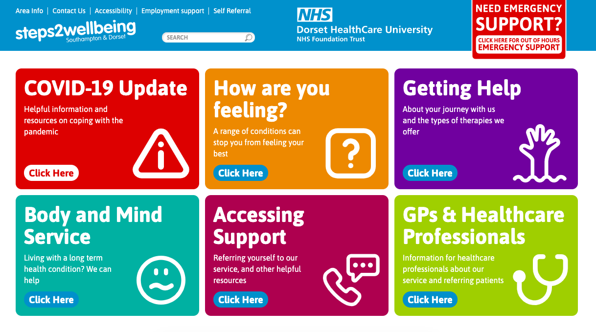
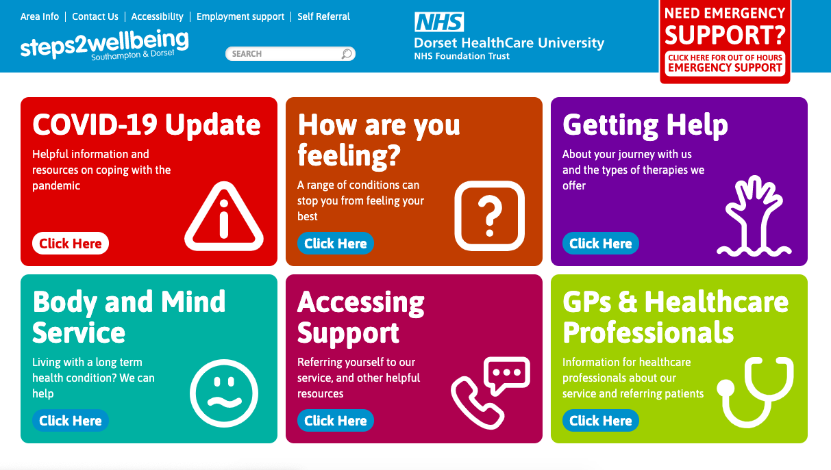
Mental Model: Self-referral is title is not intuitive for booking assessment.
Mental Model: The categories in the header section confusing user about the sections.
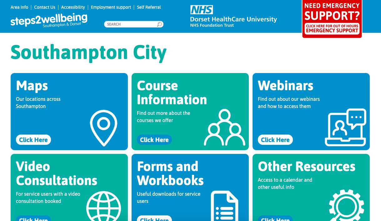
Navigation: Area info has a deep hierarchy which hard to navigate.
Feedback: Webinar section don’t have the access button to access them.
Mental Model: Self-referral and refer a patient is not in the same section.
Introduction:
Step2wellbeing is an organisation that give services for people who are suffering from mental illness such as anxiety and depression. They provide services such as signposting, Pure self-help, Guided self-help, CBT and counselling through telephone, webinars, courses, online consultations and face to face for the key users. There is an initial assessment before giving the proper service to address the issue which is done through face to face or telephone.
Context of Use:
The demographics of the website can be assessed by seeing analytics of the website traffic. Those are following.
Age Group - Old and Middle aged
More the 50% of the traffic coming from the age group of 51-100 years old, following that around 25% of the traffic coming from 21-50 age ground (2020. [online]). They could have more mental health issues because their career and relationship issues
Location - Dorset and Southampton
More the 50% of the traffic coming from the age group of 51-100 years old, following that around 25% of the traffic coming from 21-50 age ground (2020. [online]). The website also addressing these areas in home page also for face to face consultations their offices are in the same areas.
Hence majority of the users are old aged, and they may not comfortably using computers. From this assessment, the test webpages have been prioritised for usability test with respect to the scenarios.
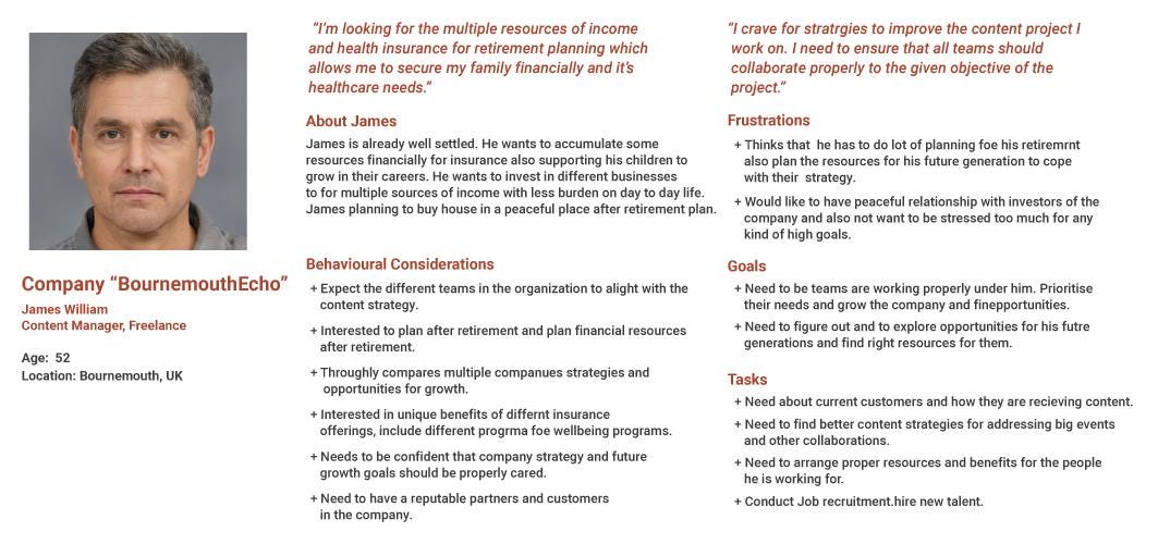
Persona:
Methodology and Tasks/Scenarios:
There are different methods for doing usability tests to measure the user experience on the website but depending on the context and constraints the specific method can be chosen even though each one has their advantages and disadvantages. The Usability method chose to this test is Cognitive Walkthrough.
Cognitive Walkthrough method was developed in 1990s in cognitive sciences from the understanding that people learn through discovery (Anon. 2020). By narrowing down the possible tasks in the website and observing the user while doing the task to achieve specific goal in the methodology. it is one of the best and easy way to learn about a product or website
Sample size
The total participants are six members as a sample size, who are having similar psychological issues in their practical lives. Adequate number of participants from different age groups to assess the tasks in terms of timing issues and user comprehensions the given scenarios.
Session Length
The usability test session will be around 50 mins, which include:
Welcome and pre-test questionnaire: 5 minutes
Task scenarios: 30 minutes
Post-test questionnaire: 15 minutes
During the test the estimated time will be noted down for each scenario.
Test Procedure
The session starts with an outline preparation, the situations depicted underneath, following that subsequent survey forms will be given.
Members won't be permitted to utilize any search functionality to find the information for step2welbeing (that is, no utilization of search engines or external information) The limitation won't express even for first experience with abstaining from affecting the members' activities. In any case, if members need to utilize outside assets, the mediator will advise them that such activity isn't took into consideration of usability test purpose.
Overview (10 minutes)
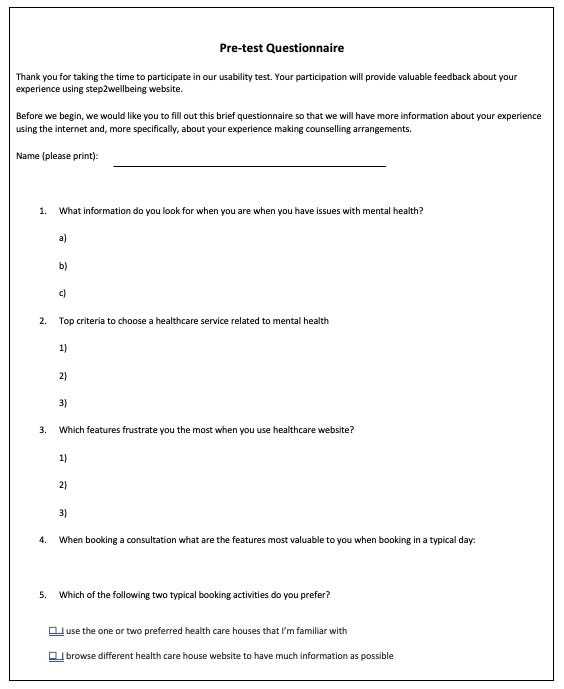
The mediator will invite the member and explain about the test and take consent from them. Next, the mediator clarifies the doubts about process. Additionally, the arbitrator will furnish the member with the pre-test survey.
Fig Pre-test questionnaire for getting participant information
Scenarios (30 mins)
Scenarios
Tasks
User want to find the information about services / therapies
Find information about services given by Step2wellbeing
Find the procedure for assessing the mental health problem
Find types of initial assessment methods
Find stories of other patients who got benefited
User wants to find the information about mental health issues to assess his symptoms
Find information about mental health illnesses & symptoms
User wants to find resources for self help
Find online courses
Find webinars
Find forums and workbooks
Find Covid 19 resources
Find Mental health apps
User wants to contact the centre for appointment for assessment of mental condition
Find the contact information
Find the centre address
Make a video call for initial assessment
Find updates about centre
Self-refer for yourself
Refer another patient
Cancel/Modify appointment
Moderator Task (5 - 10 minutes)
Participant Number
Date/time of session:
Scenario/task
Issue/problem
Observer’s name and comment
Tasks
Number Identified Issues
Comments related to task
Closing (5 - 10 minutes)
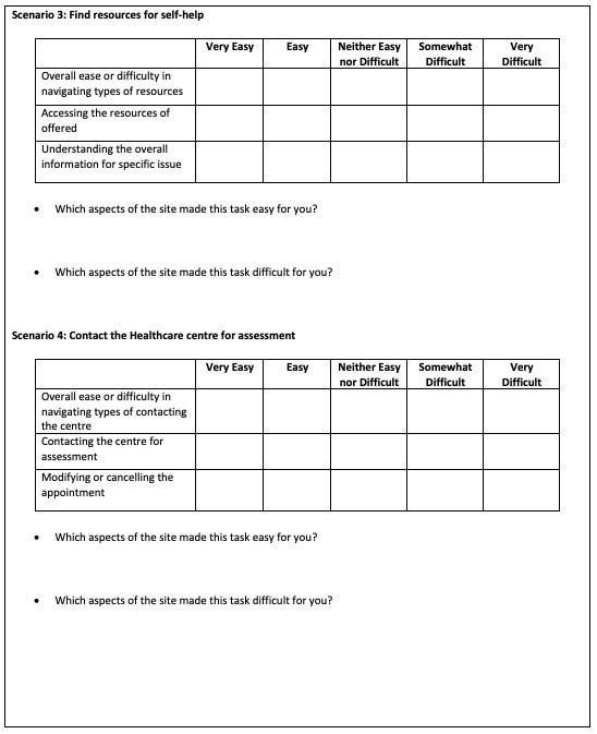
Fig: Post-task questionnaire to get immediate feedback after each scenario
Fig: Post-test questionnaire will be given to the participant by the moderator
User Task Assessment
Will Users Understand how to start the task?
Are the controls conspicuous?
Will Users Know the control is the correct one
Was there feedback to indicate the task was complete or incomplete
Were you able to complete the task?
User Comment
S 1: Find Information about services offered
Task 1:
Header categories are not clear to navigate
Task 2
Prioritising Getting Help Section is needed
Task 3
Not clear information
Task 4
Separate column needed
S 2: Find Information about types mental health issues & issues to assess the condition
Task 1:
Mention as points rather than features
S 3: Contact the Healthcare centre for assessment
Task 1:
Easy to navigate
Task 2:
Header section categories are confusing
S 4: Contact the Healthcare centre for assessment
Task 1
Easy
Task 2
Difficult to Find
Task 3
No
Task 4
Yes
Task 5
No
Task 6
No
Task 7
No
Completion Rate of Individuals
Scenarios (1= Completed, 0.5 = Half Completed, 0 =Failed to Complete)
Average: Average completion rate for each task
Time on Task: Average time took to complete each task
SUS Scale
Key Findings
Too many Categories in header section confusing the user
Resources are in the deep hierarchy which are not intuitive and difficult for user to navigate
Resources are in the deep hierarchy which are not intuitive
Self- Referral Button is not consistent
The search is not optimised to the user’s mental models
Key Findings and Recommendations
Severity Rating based on 10 usability heuristics
Visibility of system status: Keep users informed about what is happening through appropriate feedback within a reasonable time.
Match between system and the real world: Speak the users' language, with words, phrases, and concepts familiar to them, rather than system-oriented terms.
User control and freedom: Provide users with an easy way to undo actions and escape from unintended states.
Consistency and standards: Follow platform conventions and maintain consistency within the interface to reduce the need for users to think about how to interact with the system.
Error prevention: Design interfaces to prevent errors whenever possible, either by eliminating error-prone conditions or by providing confirmation options.
Recognition rather than recall: Minimize the user's memory load by making objects, actions, and options visible and easily accessible.
Flexibility and efficiency of use: Accommodate both novice and expert users with shortcuts, accelerators, and other means of efficiency.
Aesthetic and minimalist design: Strive for interfaces that present only the information users need at the moment, in a clear and concise manner.
Help users recognize, diagnose, and recover from errors: Provide meaningful error messages that clearly indicate the problem and suggest a solution.
Help and documentation: Offer help and documentation to users when necessary, but strive to make the interface self-explanatory and intuitive enough that it is seldom needed.
Study findings
Information about categories of mental illness is confusing for the user to navigate
4, 3
Reduce categories to 3, such as Services, Getting Help, Mental Illnesses
2
Mental models of Icons (“How are you feeling?”, “Body and Mind Services”) are difficult to recognise the title
2, 1
Keep icons which are close to the title mental model
3
Deep Hierarchy for Area Info is not intuitive: Home > Are Info > Southampton > Southampton City
4, 3
Resources are useful for self-help, it can be prioritised in the Home page
4
“Area info” title is misleading title for the resources
4, 1
The content inside of link can be a map
5
No CTA to access Webinar and videos Consultation
4, 3
The availability of resources should indicate
6
Course Information, Webinars, Forms and Workbooks, other resources - most of the, same but present in
2, 3
The information resources can be kept in one location
7
Video Consultation CTA button is not intuitive for user to find and title of the section is not easy to recognise
4, 1
Make a separate button which can be clearly visible to the user
8
Self-referral button title is misleading (Appointment mental model problem)
4, 1
Change the title of self-Referral button to Appointment Application
9
“Click here to start the process” button is same CTA for self-referral (inconsistency)
3, 1
Maintain the same title across all pages.
10
Refer a patient is not intuitive to find it due to the location CTA location
3, 2
Refer a Patient also can be in the same section of self-referral.
11
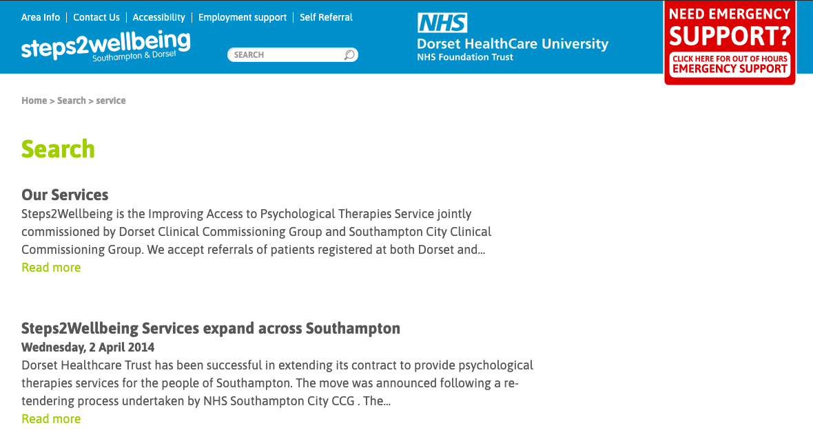
Search is not giving results according to the mental model of the user. Spelling mistakes are not being corrected.
2, 4
Correct the search results according to the user’s mental model and correct spelling mistakes
12
Search bar size is smaller which is not accessible for aged users
2, 1
Search bar size is should be bigger
13
Employee support title is misleading
2, 1
Employee support title is misleading

